Thursday, 29 October 2009
After talking with tutors and analyzing my final website, i decided that on the whole i had created a successful working website, although there would be a few things that i would change about it.
One being the portfolio page, i would have liked to have put thumb nails of my images in the small mouse over boxes at the edge as others have pointed out that the white boxes could be seen as the page not working. I would also have links to every page on each page rather than just the link to the homepage as this allows people to navigate though the site more easily. The final thing that would make the site look a bit more professional would be to set the size of my website to fit the whole screen rather than just part of it. With these small issues addressed i think the site could have been more successful. But on a whole i am happy with the final site.
Thursday, 22 October 2009
Tuesday, 20 October 2009
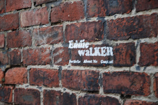
 I was worried at first the bricks in the background may be too over powering around my portfolio images. This was one of the solutions. I did not like this as much as the normal brick wall background and it seemed that the bricks did not take as much away from the images as i had previously thought, so i will not use this image.
Inspiration- www.cooperillo.com. The rollovers on this illustration website aare similar to the ones i want to achieve.
- www.arcticmonkeys.com. The typography and layout of the website were influential to my ytpeface choice. It would have been good to be able to design my own.
-www.logodesign.co.uk. The layout of this was more influential when i was making my wire frames. The clean lines and simple and easy to use layout. Also shows a good way for me to display my animation once i have completed it.
Subscribe to:
Posts (Atom)


